Visualizing Graphical Models
Here we use daft by David S. Fulford, Dan Foreman-Mackey and David W. Hogg to visualize probabilistic graphical models .
For more on graphical models:
Foundations of Graphical Models by David Blei – see Basics of Graphical Models
semantics of graphical models (called “Boiler plate diagrams” in the tech report) and an extended visual language Directed Factor Graph Notation for Generative Models Laura Dietz, which is the basis of the
tikz-bayesnetpackage
import daft
from matplotlib import rc

rc("font", family="serif", size=12)
rc("text", usetex=True)
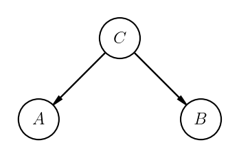
Conditional independence
Random variables \(A\) and \(B\) are conditionally independent given \(C\) if and only if
This is often written \( A \perp\kern-5pt\perp B \mid C\). The graphical model for this situation looks like this:
pgm = daft.PGM()
pgm.add_node("A", r"$A$", -1, 0)
pgm.add_node("B", r"$B$", 1, 0)
pgm.add_node("C", r"$C$", 0, 1)
pgm.add_edge("C", "A")
pgm.add_edge("C", "B")
pgm.render(dpi=150)
pgm.savefig("../assets/AperpBmidC.png", dpi=150)
An weak lensing example
Origin of Weak Lensing Example
pgm = daft.PGM()
pgm.add_node("Omega", r"$\Omega$", -1, 4)
pgm.add_node("gamma", r"$\gamma$", 0, 4)
pgm.add_node("obs", r"$\epsilon^{\mathrm{obs}}_n$", 1, 4, observed=True)
pgm.add_node("alpha", r"$\alpha$", 3, 4)
pgm.add_node("true", r"$\epsilon^{\mathrm{true}}_n$", 2, 4)
pgm.add_node("sigma", r"$\sigma_n$", 1, 3)
pgm.add_node("Sigma", r"$\Sigma$", 0, 3)
pgm.add_node("x", r"$x_n$", 2, 3, observed=True)
pgm.add_plate([0.5, 2.25, 2, 2.25], label=r"galaxies $n$")
pgm.add_edge("Omega", "gamma")
pgm.add_edge("gamma", "obs")
pgm.add_edge("alpha", "true")
pgm.add_edge("true", "obs")
pgm.add_edge("x", "obs")
pgm.add_edge("Sigma", "sigma")
pgm.add_edge("sigma", "obs")

pgm.render(dpi=150)
#pgm.savefig("weaklensing.pdf")
#pgm.savefig("weaklensing.png", dpi=150)
<matplotlib.axes._axes.Axes at 0x7fafc93525b0>
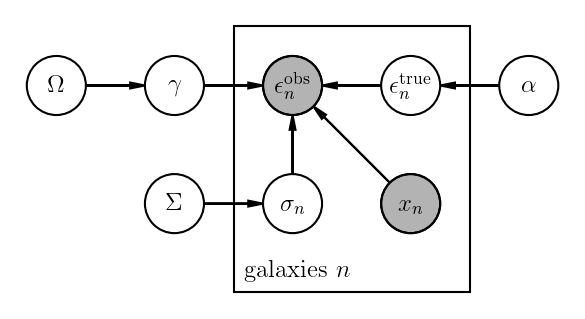
This graphical model is equivalent to factorizing the joint distribution according to this equation:
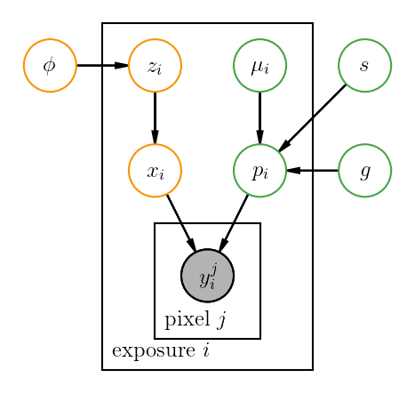
An exoplanets example
# Colors.
p_color = {"ec": "#46a546"}
s_color = {"ec": "#f89406"}

pgm = daft.PGM()

n = daft.Node("phi", r"$\phi$", 1, 3, plot_params=s_color)
n.va = "baseline"
pgm.add_node(n)
pgm.add_node("speckle_coeff", r"$z_i$", 2, 3, plot_params=s_color)
pgm.add_node("speckle_img", r"$x_i$", 2, 2, plot_params=s_color)

pgm.add_node("spec", r"$s$", 4, 3, plot_params=p_color)
pgm.add_node("shape", r"$g$", 4, 2, plot_params=p_color)
pgm.add_node("planet_pos", r"$\mu_i$", 3, 3, plot_params=p_color)
pgm.add_node("planet_img", r"$p_i$", 3, 2, plot_params=p_color)

pgm.add_node("pixels", r"$y_i ^j$", 2.5, 1, observed=True)

# Edges.
pgm.add_edge("phi", "speckle_coeff")
pgm.add_edge("speckle_coeff", "speckle_img")
pgm.add_edge("speckle_img", "pixels")

pgm.add_edge("spec", "planet_img")
pgm.add_edge("shape", "planet_img")
pgm.add_edge("planet_pos", "planet_img")
pgm.add_edge("planet_img", "pixels")

# And a plate.
pgm.add_plate([1.5, 0.2, 2, 3.2], label=r"exposure $i$", shift=-0.1)
pgm.add_plate([2, 0.5, 1, 1], label=r"pixel $j$", shift=-0.1)

# Render and save.
pgm.render(dpi=150)
#pgm.savefig("exoplanets.pdf")
#pgm.savefig("exoplanets.png", dpi=150)
<matplotlib.axes._axes.Axes at 0x7fafc93af100>