Simple data exploration
In this notebook we will explore a dataset from an article by a team at autodesk (which I link to below). We can think of this as the simple data exploration you might do when you first start working with a new dataset.
First, we will load pandas and numpy, and read the comma-separated-value (CSV) file into a pandas dataframe.
import pandas as pd
import numpy as np
import matplotlib.pyplot as plt
from matplotlib import rcParams
# figure size in inches
rcParams['figure.figsize'] = 6,6
df = pd.read_csv("./assets/DatasaurusDozen-long.csv")
df
| x | y | label | |
|---|---|---|---|
| 0 | 32.331110 | 61.411101 | away |
| 1 | 53.421463 | 26.186880 | away |
| 2 | 63.920202 | 30.832194 | away |
| 3 | 70.289506 | 82.533649 | away |
| 4 | 34.118830 | 45.734551 | away |
| ... | ... | ... | ... |
| 1841 | 34.794594 | 13.969683 | x_shape |
| 1842 | 79.221764 | 22.094591 | x_shape |
| 1843 | 36.030880 | 93.121733 | x_shape |
| 1844 | 34.499558 | 86.609985 | x_shape |
| 1845 | 31.106867 | 89.461635 | x_shape |
1846 rows × 3 columns
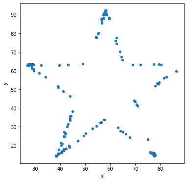
From the webpage where I found the dataset, I know that really this dataframe has merged 13 sub-datasets that are labeled by the collumn label.
Take action
Let’s check to see what the unique values for the label are.
df["label"].unique()
array(['away', 'bullseye', 'circle', 'dino', 'dots', 'h_lines',
       'high_lines', 'slant_down', 'slant_up', 'star', 'v_lines',
       'wide_lines', 'x_shape'], dtype=object)
Take action
Let’s check the mean and covariance for x and y for the label='dots'.
We will use the selection by callable functionality in pandas.
selector = lambda df: df['label'] =='dino'
df.loc[selector].cov()
| x | y | |
|---|---|---|
| x | 281.069988 | -29.113933 |
| y | -29.113933 | 725.515961 |
df.loc[selector].mean()
x    54.263273
y    47.832253
dtype: float64
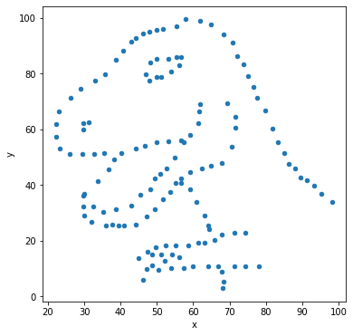
Ok, great, so we know the mean and the covariance for the data in the dino sub-dataset.
Visualize the data
Stop and think
What do you think the data looks like?
Maybe you think it looks like a 2-d Gaussian, that’s reasoanble since all we know is the mean and the covariance.
Take action
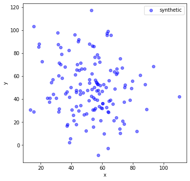
Let’s make a synthetic dataset with that mean and covariance.
# convert mean and cov to a numpy array:
np_mean = df.loc[lambda df: df['label'] =='dino', :].mean().to_numpy()
np_cov = df.loc[lambda df: df['label'] =='dino', :].cov().to_numpy()
# generate some synthetic data
n_to_generate = df.loc[selector,'label'].count()
norm_data = np.random.multivariate_normal(mean=np_mean, cov=np_cov,size=n_to_generate)
#df.loc[lambda df: df['label'] =='dots', :].plot('x','y',kind='scatter', c='red', alpha=.5,label='dino')
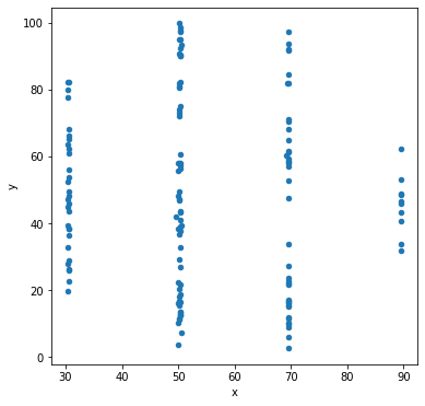
plt.scatter(norm_data[:,0],norm_data[:,1], c='blue', alpha=.5, label='synthetic')
plt.xlabel('x')
plt.ylabel('y')
plt.legend()
<matplotlib.legend.Legend at 0x7fbe806a7a60>
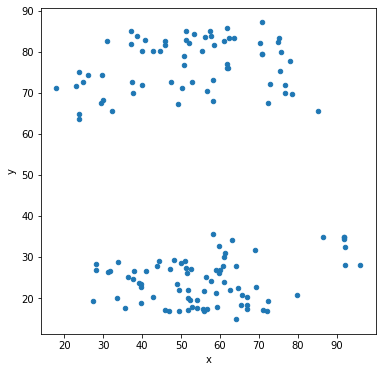
Take action
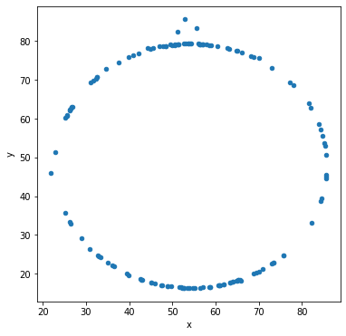
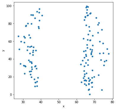
Let’s compare the synthetic dataset with the actual data
df.loc[lambda df: df['label'] =='dino', :].plot('x','y',kind='scatter', c='red', alpha=.5,label='label == dino')
#plt.scatter(norm_data[:,0],norm_data[:,1], c='blue', alpha=.5, label='synthetic')
plt.xlabel('x')
plt.ylabel('y')
plt.legend()
<matplotlib.legend.Legend at 0x7fbea28a02e0>
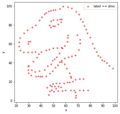
The synthetic data and the real data don’t look similar at all. The mean and covariance aren’t telling us the full story
Hint
Visualizing your data is a good idea, simple summary statistics don’t tell the full story.
Repeat using pandas “groupby” functionality
Take action
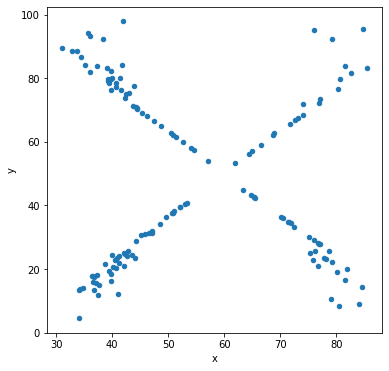
Now let’s check the covariance between x and y grouped by all the labels
Notice that each sub-dataset has essentially the same 2x2 covariance matrix.
df.groupby('label').cov()
| x | y | ||
|---|---|---|---|
| label | |||
| away | x | 281.227029 | -28.971572 |
| y | -28.971572 | 725.749775 | |
| bullseye | x | 281.207393 | -30.979902 |
| y | -30.979902 | 725.533372 | |
| circle | x | 280.898024 | -30.846620 |
| y | -30.846620 | 725.226844 | |
| dino | x | 281.069988 | -29.113933 |
| y | -29.113933 | 725.515961 | |
| dots | x | 281.156953 | -27.247681 |
| y | -27.247681 | 725.235215 | |
| h_lines | x | 281.095333 | -27.874816 |
| y | -27.874816 | 725.756931 | |
| high_lines | x | 281.122364 | -30.943012 |
| y | -30.943012 | 725.763490 | |
| slant_down | x | 281.124206 | -31.153399 |
| y | -31.153399 | 725.553749 | |
| slant_up | x | 281.194420 | -30.992806 |
| y | -30.992806 | 725.688605 | |
| star | x | 281.197993 | -28.432772 |
| y | -28.432772 | 725.239695 | |
| v_lines | x | 281.231512 | -31.371608 |
| y | -31.371608 | 725.638809 | |
| wide_lines | x | 281.232887 | -30.075267 |
| y | -30.075267 | 725.650560 | |
| x_shape | x | 281.231481 | -29.618418 |
| y | -29.618418 | 725.224991 |
… and the means are the same too.
df.groupby('label').mean()
| x | y | |
|---|---|---|
| label | ||
| away | 54.266100 | 47.834721 |
| bullseye | 54.268730 | 47.830823 |
| circle | 54.267320 | 47.837717 |
| dino | 54.263273 | 47.832253 |
| dots | 54.260303 | 47.839829 |
| h_lines | 54.261442 | 47.830252 |
| high_lines | 54.268805 | 47.835450 |
| slant_down | 54.267849 | 47.835896 |
| slant_up | 54.265882 | 47.831496 |
| star | 54.267341 | 47.839545 |
| v_lines | 54.269927 | 47.836988 |
| wide_lines | 54.266916 | 47.831602 |
| x_shape | 54.260150 | 47.839717 |
Take action
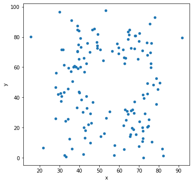
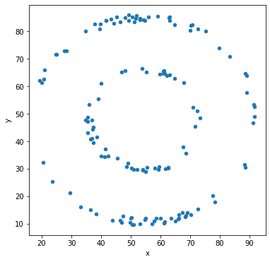
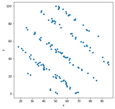
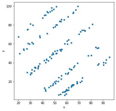
Let’s make scatter plots grouped by the label for the sub-dataset.
df.groupby('label').plot('x','y',kind='scatter')
label
away          AxesSubplot(0.125,0.125;0.775x0.755)
bullseye      AxesSubplot(0.125,0.125;0.775x0.755)
circle        AxesSubplot(0.125,0.125;0.775x0.755)
dino          AxesSubplot(0.125,0.125;0.775x0.755)
dots          AxesSubplot(0.125,0.125;0.775x0.755)
h_lines       AxesSubplot(0.125,0.125;0.775x0.755)
high_lines    AxesSubplot(0.125,0.125;0.775x0.755)
slant_down    AxesSubplot(0.125,0.125;0.775x0.755)
slant_up      AxesSubplot(0.125,0.125;0.775x0.755)
star          AxesSubplot(0.125,0.125;0.775x0.755)
v_lines       AxesSubplot(0.125,0.125;0.775x0.755)
wide_lines    AxesSubplot(0.125,0.125;0.775x0.755)
x_shape       AxesSubplot(0.125,0.125;0.775x0.755)
dtype: object
Other types of data visualization
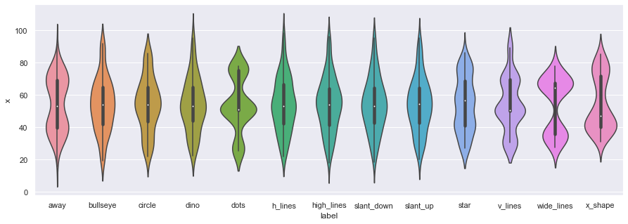
In addition to scatter plots, we can also use the seaborn library to make violin plots, which allows us to compare individual marginal distributions grouped by the sub-dataset label.
import seaborn as sns
sns.set(rc={'figure.figsize':(15,5)})
ax = sns.violinplot(x="label",y="x", data=df)
#fig = plt.gcf()
#fig.set_size_inches(15, 5)
ax = sns.violinplot(x="label",y="y", data=df,figsize=(15,5))
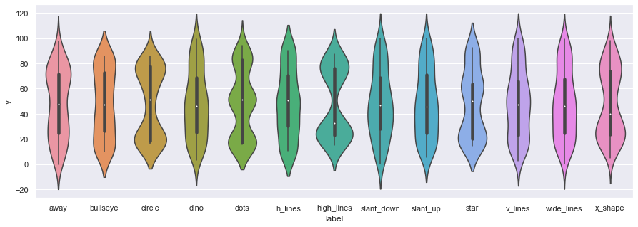
We can also use boxplots
ax = sns.boxplot(x="label",y="y", data=df)
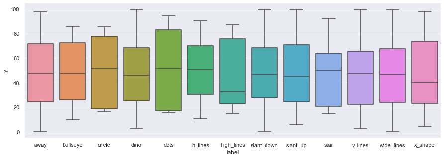
…but
Be wary of boxplots! They might be obscuring important information.https://t.co/amnbAYvsq1 pic.twitter.com/7YxslPGp1n
— Justin Matejka (@JustinMatejka) August 9, 2017
Final thoughts
The data set above comes from this post by Autodesk research:
 Same Stats, Different Graphs: Generating Datasets with Varied Appearance and Identical Statistics through Simulated Annealing
 CHI 2017 Conference proceedings:
 ACM SIGCHI Conference on Human Factors in Computing Systems
It was inspired by this tweet from Alberto Cairo:
Don't trust summary statistics. Always visualize your data first https://t.co/63RxirsTuY pic.twitter.com/5j94Dw9UAf
— Alberto Cairo (@AlbertoCairo) August 15, 2016
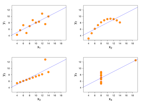
A more well-known example is known as Anscombe Quartet
This wikipedia article on Correlation and Dependence is also great, the bottom row shows examples of two variables that are uncorrelated, but not statistically independent, eg. we can’t factorize the joint \(p(X,Y)\) as \(p(X)p(Y)\).

Finally, here’s a cool tool for quickly making a csv dataset: Draw my data
And finally, here’s a short video from Autodesk: