How do distributions transform under a change of variables ?
Kyle Cranmer, March 2016
%pylab inline --no-import-all
Populating the interactive namespace from numpy and matplotlib
We are interested in understanding how distributions transofrm under a change of variables. Let’s start with a simple example. Think of a spinner like on a game of twister.
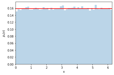
We flick the spinner and it stops. Let’s call the angle of the pointer \(x\). It seems a safe assumption that the distribution of \(x\) is uniform between \([0,2\pi)\)… so \(p_x(x) = 1/\sqrt{2\pi}\)
Now let’s say that we change variables to \(y=\cos(x)\) (sorry if the names are confusing here, don’t think about x- and y-coordinates, these are just names for generic variables). The question is this: what is the distribution of y? Let’s call it \(p_y(y)\)
Well it’s easy to do with a simulation, let’s try it out
# generate samples for x, evaluate y=cos(x)
n_samples = 100000
x = np.random.uniform(0,2*np.pi,n_samples)
y = np.cos(x)
# make a histogram of x
n_bins = 50
counts, bins, patches = plt.hist(x, bins=50, density=True, alpha=0.3)
plt.plot([0,2*np.pi], (1./2/np.pi, 1./2/np.pi), lw=2, c='r')
plt.xlim(0,2*np.pi)
plt.xlabel('x')
plt.ylabel('$p_x(x)$')
Text(0, 0.5, '$p_x(x)$')
Ok, now let’s make a histogram for \(y=\cos(x)\)
counts, y_bins, patches = plt.hist(y, bins=50, density=True, alpha=0.3)
plt.xlabel('y')
plt.ylabel('$p_y(y)$')
Text(0, 0.5, '$p_y(y)$')
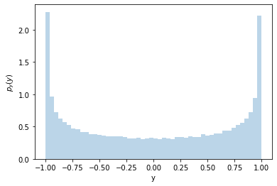
It’s not uniform! Why is that? Let’s look at the \(x-y\) relationship
# make a scatter of x,y
plt.scatter(x[:300],y[:300]) #just the first 300 points

xtest = .2
plt.plot((-1,xtest),(np.cos(xtest),np.cos(xtest)), c='r')
plt.plot((xtest,xtest),(-1.5,np.cos(xtest)), c='r')
xtest = xtest+.1
plt.plot((-1,xtest),(np.cos(xtest),np.cos(xtest)), c='r')
plt.plot((xtest,xtest),(-1.5,np.cos(xtest)), c='r')

xtest = 2*np.pi-xtest
plt.plot((-1,xtest),(np.cos(xtest),np.cos(xtest)), c='g')
plt.plot((xtest,xtest),(-1.5,np.cos(xtest)), c='g')
xtest = xtest+.1
plt.plot((-1,xtest),(np.cos(xtest),np.cos(xtest)), c='g')
plt.plot((xtest,xtest),(-1.5,np.cos(xtest)), c='g')


xtest = np.pi/2
plt.plot((-1,xtest),(np.cos(xtest),np.cos(xtest)), c='r')
plt.plot((xtest,xtest),(-1.5,np.cos(xtest)), c='r')
xtest = xtest+.1
plt.plot((-1,xtest),(np.cos(xtest),np.cos(xtest)), c='r')
plt.plot((xtest,xtest),(-1.5,np.cos(xtest)), c='r')

xtest = 2*np.pi-xtest
plt.plot((-1,xtest),(np.cos(xtest),np.cos(xtest)), c='g')
plt.plot((xtest,xtest),(-1.5,np.cos(xtest)), c='g')
xtest = xtest+.1
plt.plot((-1,xtest),(np.cos(xtest),np.cos(xtest)), c='g')
plt.plot((xtest,xtest),(-1.5,np.cos(xtest)), c='g')


plt.ylim(-1.5,1.5)
plt.xlim(-1,7)
(-1.0, 7.0)
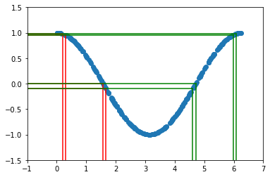
The two sets of vertical lines are both separated by \(0.1\). The probability \(P(a < x < b)\) must equal the probability of \(P( cos(b) < y < cos(a) )\). In this example there are two different values of \(x\) that give the same \(y\) (see green and red lines), so we need to take that into account. For now, let’s just focus on the first part of the curve with \(x<\pi\).
So we can write (this is the important equation):
where \(y_a = \cos(a)\) and \(y_b = \cos(b)\).
and we can re-write the integral on the right by using a change of variables (pure calculus)
notice that the limits of integration and integration variable are the same for the left and right sides of the equation, so the integrands must be the same too. Therefore:
and equivalently
The factor \(\left|\frac{dy}{dx} \right|\) is called a Jacobian. When it is large it is stretching the probability in \(x\) over a large range of \(y\), so it makes sense that it is in the denominator.
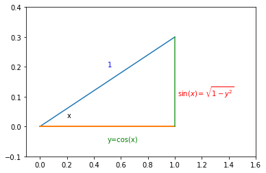
plt.plot((0.,1), (0,.3))
plt.plot((0.,1), (0,0), lw=2)
plt.plot((1.,1), (0,.3))
plt.ylim(-.1,.4)
plt.xlim(-.1,1.6)
plt.text(0.5,0.2, '1', color='b')
plt.text(0.2,0.03, 'x', color='black')
plt.text(0.5,-0.05, 'y=cos(x)', color='g')
plt.text(1.02,0.1, '$\sin(x)=\sqrt{1-y^2}$', color='r')
Text(1.02, 0.1, '$\\sin(x)=\\sqrt{1-y^2}$')
In our case:
Looking at the right-triangle above you can see \(\sin(x)=\sqrt{1-y^2}\) and finally there will be an extra factor of 2 for \(p_y(y)\) to take into account \(x>\pi\). So we arrive at
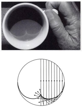
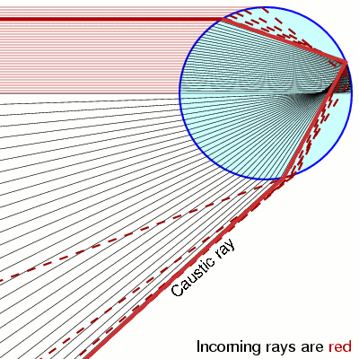
Notice that when \(y=\pm 1\) the pdf is diverging. This is called a caustic and you see them in your coffee and rainbows!
|
|
Let’s check our prediction
counts, y_bins, patches = plt.hist(y, bins=50, density=True, alpha=0.3)
pdf_y = (1./np.pi)/np.sqrt(1.-y_bins**2)
plt.plot(y_bins, pdf_y, c='r', lw=2)
plt.ylim(0,5)
plt.xlabel('y')
plt.ylabel('$p_y(y)$')
Text(0, 0.5, '$p_y(y)$')
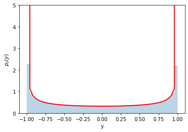
Perfect!
A trick using the cumulative distribution function (cdf) to generate random numbers
Let’s consider a different variable transformation now – it is a special one that we can use to our advantage.
Here’s a plot of a distribution and cdf for a Gaussian.
(NOte: the axes are different for the pdf and the cdf http://matplotlib.org/examples/api/two_scales.html
from scipy.stats import norm
x_for_plot = np.linspace(-3,3, 30)
fig, ax1 = plt.subplots()

ax1.plot(x_for_plot, norm.pdf(x_for_plot), c='b')
ax1.set_ylabel('p(x)', color='b')
for tl in ax1.get_yticklabels():
    tl.set_color('b')

ax2 = ax1.twinx()
ax2.plot(x_for_plot, norm.cdf(x_for_plot), c='r')
ax2.set_ylabel('cdf(x)', color='r')
for tl in ax2.get_yticklabels():
    tl.set_color('r')
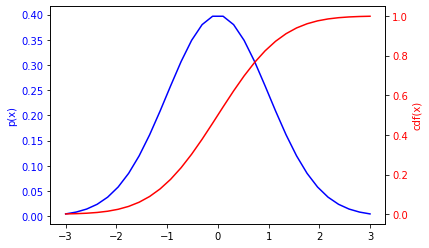
Ok, so let’s use our result about how distributions transform under a change of variables to predict the distribution of \(y=cdf(x)\). We need to calculate
Just like particles and anti-particles, when derivatives meet anti-derivatives they annihilate. So \(\frac{dy}{dx} = p_x(x)\), which shouldn’t be a surprise.. the slope of the cdf is the pdf.
So putting these together we find the distribution for \(y\) is:
So it’s just a uniform distribution from \([0,1]\), which is perfect for random numbers.
We can turn this around and generate a uniformly random number between \([0,1]\), take the inverse of the cdf and we should have the distribution we want for \(x\).
Let’s try it for a Gaussian. The inverse of the cdf for a Gaussian is called ppf
norm.ppf.__doc__
'\n Percent point function (inverse of `cdf`) at q of the given RV.\n\n Parameters\n ----------\n q : array_like\n lower tail probability\n arg1, arg2, arg3,... : array_like\n The shape parameter(s) for the distribution (see docstring of the\n instance object for more information)\n loc : array_like, optional\n location parameter (default=0)\n scale : array_like, optional\n scale parameter (default=1)\n\n Returns\n -------\n x : array_like\n quantile corresponding to the lower tail probability q.\n\n '
#check it out
norm.cdf(0), norm.ppf(0.5)
(0.5, 0.0)
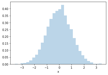
Ok, let’s use CDF trick to generate Normally-distributed (aka Gaussian-distributed) random numbers
rand_cdf = np.random.uniform(0,1,10000)
rand_norm = norm.ppf(rand_cdf)
_ = plt.hist(rand_norm, bins=30, density=True, alpha=0.3)
plt.xlabel('x')
Text(0.5, 0, 'x')
Pros: The great thing about this technique is it is very efficient. You only generate one random number per random \(x\).
Cons: the downside is you need to know how to compute the inverse cdf for \(p_x(x)\) and that can be difficult. It works for a distribution like a Gaussian, but for some random distribution this might be even more computationally expensive than the accept/reject approach. This approach also doesn’t really work if your distribution is for more than one variable.
Going full circle
Ok, let’s try it for our distribution of \(y=\cos(x)\) above. We found
So the CDF is (see Wolfram alpha for integral )
and we know that for \(y=-1\) the CDF must be 0, so the constant is \(1/2\) and by looking at the plot or remembering some trig you know that it’s also \(cdf(y') = (1/\pi) \arccos(y')\).
So to apply the trick, we need to generate uniformly random variables \(z\) between 0 and 1, and then take the inverse of the cdf to get \(y\). Ok, so what would that be:
Of course! that’s how we started in the first place, we started with a uniform \(x\) in \([0,2\pi]\) and then defined \(y=\cos(x)\). So we just worked backwards to get where we started. The only difference here is that we only evaluate the first half: \(\cos(x < \pi)\)