Visualizing joint and marginal distributions
Let’s explore a dataset that has 4 continuous random variables and one discrete random variable. We will visualize various 1-D and 2-D marginal distributions. The 2-d distributions are joint distributions in the context of the two random variables being plotted, but are marginal distributions in the context of the full dataset.
import seaborn as sns
sns.__version__ # check version, need 0.11.0 or greater
'0.11.0'
penguins = sns.load_dataset("penguins")
penguins
| species | island | bill_length_mm | bill_depth_mm | flipper_length_mm | body_mass_g | sex | |
|---|---|---|---|---|---|---|---|
| 0 | Adelie | Torgersen | 39.1 | 18.7 | 181.0 | 3750.0 | Male |
| 1 | Adelie | Torgersen | 39.5 | 17.4 | 186.0 | 3800.0 | Female |
| 2 | Adelie | Torgersen | 40.3 | 18.0 | 195.0 | 3250.0 | Female |
| 3 | Adelie | Torgersen | NaN | NaN | NaN | NaN | NaN |
| 4 | Adelie | Torgersen | 36.7 | 19.3 | 193.0 | 3450.0 | Female |
| ... | ... | ... | ... | ... | ... | ... | ... |
| 339 | Gentoo | Biscoe | NaN | NaN | NaN | NaN | NaN |
| 340 | Gentoo | Biscoe | 46.8 | 14.3 | 215.0 | 4850.0 | Female |
| 341 | Gentoo | Biscoe | 50.4 | 15.7 | 222.0 | 5750.0 | Male |
| 342 | Gentoo | Biscoe | 45.2 | 14.8 | 212.0 | 5200.0 | Female |
| 343 | Gentoo | Biscoe | 49.9 | 16.1 | 213.0 | 5400.0 | Male |
344 rows × 7 columns
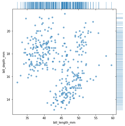
First we can visualize the raw data both as a scatter plot of xy-pairs as well as a “rug plot” showing ticks for x and y individually.
# Use JointGrid directly to draw a custom plot
g = sns.JointGrid(data=penguins, x="bill_length_mm", y="bill_depth_mm", space=0, ratio=15)
g.plot_joint(sns.scatterplot,  alpha=.6, legend=False)
g.plot_marginals(sns.rugplot, height=1,  alpha=.6)
<seaborn.axisgrid.JointGrid at 0x7fe81081f6a0>
We can make a similar kind of plot, where instead of visualizing the raw data, we use a histogram to approximate the parent distribution both for the joint and for the marginals
sns.jointplot(data=penguins, x="bill_length_mm", y="bill_depth_mm", kind="hist")
<seaborn.axisgrid.JointGrid at 0x7fe8320b53a0>
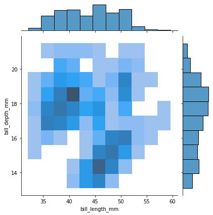
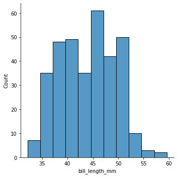
Note the marginal distribution displayed on the top is the same as just a simple histogram of bill_length_mm. When we histogram a variable \(X_i\), we implicitly are marginalizing over all the other variables in the dataset.
sns.displot(data=penguins, x="bill_length_mm", kind="hist")
<seaborn.axisgrid.FacetGrid at 0x7fe810874be0>
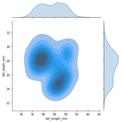
Or we can use a kernel density estimation (kde) technique to get a smoother estimate
sns.jointplot(data=penguins, x="bill_length_mm", y="bill_depth_mm", kind="kde", fill=True)
<seaborn.axisgrid.JointGrid at 0x7fe83243f460>
Grouping by class
We can also look at bill_length_mm vs. bill_depth_mm grouped by species. Before we plot, let’s look at the correlation matrix for these classes. Note that the two variables are positivley correlated in each case.
penguins[["bill_length_mm","bill_depth_mm","species"]].groupby("species").corr()
| bill_length_mm | bill_depth_mm | ||
|---|---|---|---|
| species | |||
| Adelie | bill_length_mm | 1.000000 | 0.391492 |
| bill_depth_mm | 0.391492 | 1.000000 | |
| Chinstrap | bill_length_mm | 1.000000 | 0.653536 |
| bill_depth_mm | 0.653536 | 1.000000 | |
| Gentoo | bill_length_mm | 1.000000 | 0.643384 |
| bill_depth_mm | 0.643384 | 1.000000 |
sns.jointplot(data=penguins, x="bill_length_mm", y="bill_depth_mm", kind="kde", hue="species")
<seaborn.axisgrid.JointGrid at 0x7fe8325bea60>
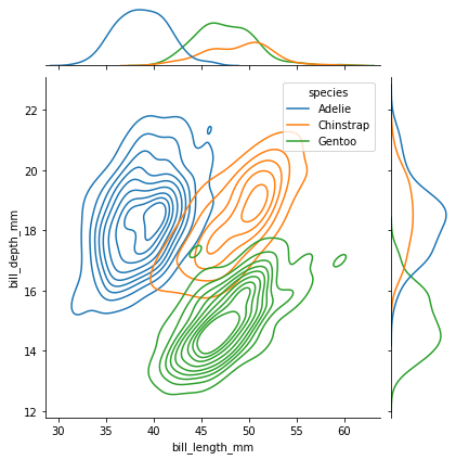
The plot above clearly reveals the origin of the multi-modal structure of the underlying data. Well it doesn’t indicate that it causes it, but species does seem to naturally map onto the different modes.
Visualizing multivariate data
Often we are working with higher dimensional data that is not so easy to visualize. In this penguin dataset, there are four continuous random variables in addition to the categorical species label. We can print the 4x4 correlation matrix grouped by species again:
penguins.groupby("species").corr()
| bill_length_mm | bill_depth_mm | flipper_length_mm | body_mass_g | ||
|---|---|---|---|---|---|
| species | |||||
| Adelie | bill_length_mm | 1.000000 | 0.391492 | 0.325785 | 0.548866 |
| bill_depth_mm | 0.391492 | 1.000000 | 0.307620 | 0.576138 | |
| flipper_length_mm | 0.325785 | 0.307620 | 1.000000 | 0.468202 | |
| body_mass_g | 0.548866 | 0.576138 | 0.468202 | 1.000000 | |
| Chinstrap | bill_length_mm | 1.000000 | 0.653536 | 0.471607 | 0.513638 |
| bill_depth_mm | 0.653536 | 1.000000 | 0.580143 | 0.604498 | |
| flipper_length_mm | 0.471607 | 0.580143 | 1.000000 | 0.641559 | |
| body_mass_g | 0.513638 | 0.604498 | 0.641559 | 1.000000 | |
| Gentoo | bill_length_mm | 1.000000 | 0.643384 | 0.661162 | 0.669166 |
| bill_depth_mm | 0.643384 | 1.000000 | 0.706563 | 0.719085 | |
| flipper_length_mm | 0.661162 | 0.706563 | 1.000000 | 0.702667 | |
| body_mass_g | 0.669166 | 0.719085 | 0.702667 | 1.000000 |
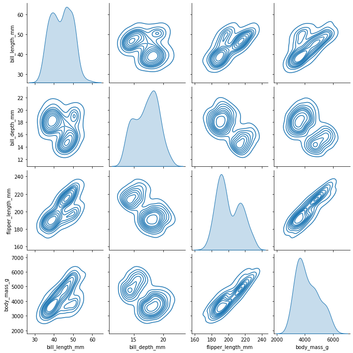
But we can also make what is called a pairplot that makes a grid of plots. On the off-diagonal one either plots a scatter plot of \(X_i\) vs. \(X_j\) or an estimate of \(p(X_i,X_j)\) – note \(p(X_i,X_j)\) is 2-d, but it is actually marginalizing over all the other random variables. Along the diagonal \(X_i=X_j\), trying to visualize a 2-D distribution doesn’t make much sense. Instead, along the diagonal one usually plots the univariate marginal \(p(X_i)\).
sns.pairplot(penguins, kind="kde")
<seaborn.axisgrid.PairGrid at 0x7fe8603e2490>
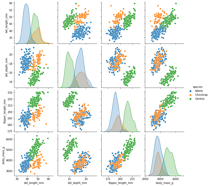
And we can do both a pairplot grouped by species, which reveals a lot about this dataset.
sns.pairplot(penguins, hue="species");
Note there were problems with seaborn 0.10.1