Example: Custom Axes Walkthrough
This example demonstrates how to use custom axes to visualize data along semantically meaningful directions. We’ll use the Iris dataset and create axes based on the differences between class centroids (barycenters).
Overview
The example-custom-axes saved session demonstrates:
Custom Axes from Barycenters: Creating axes from centroid differences
Custom Axes View: Visualizing data projected onto these axes
Custom Affine Transformation: Creating a derived layer with a change of basis
Comparing Views: Side-by-side comparison of original and transformed coordinates
Loading the Example
Click Open in the toolbar
Select example-custom-axes from the Saved Sessions list
The session loads with all layers, views, and custom axes configured
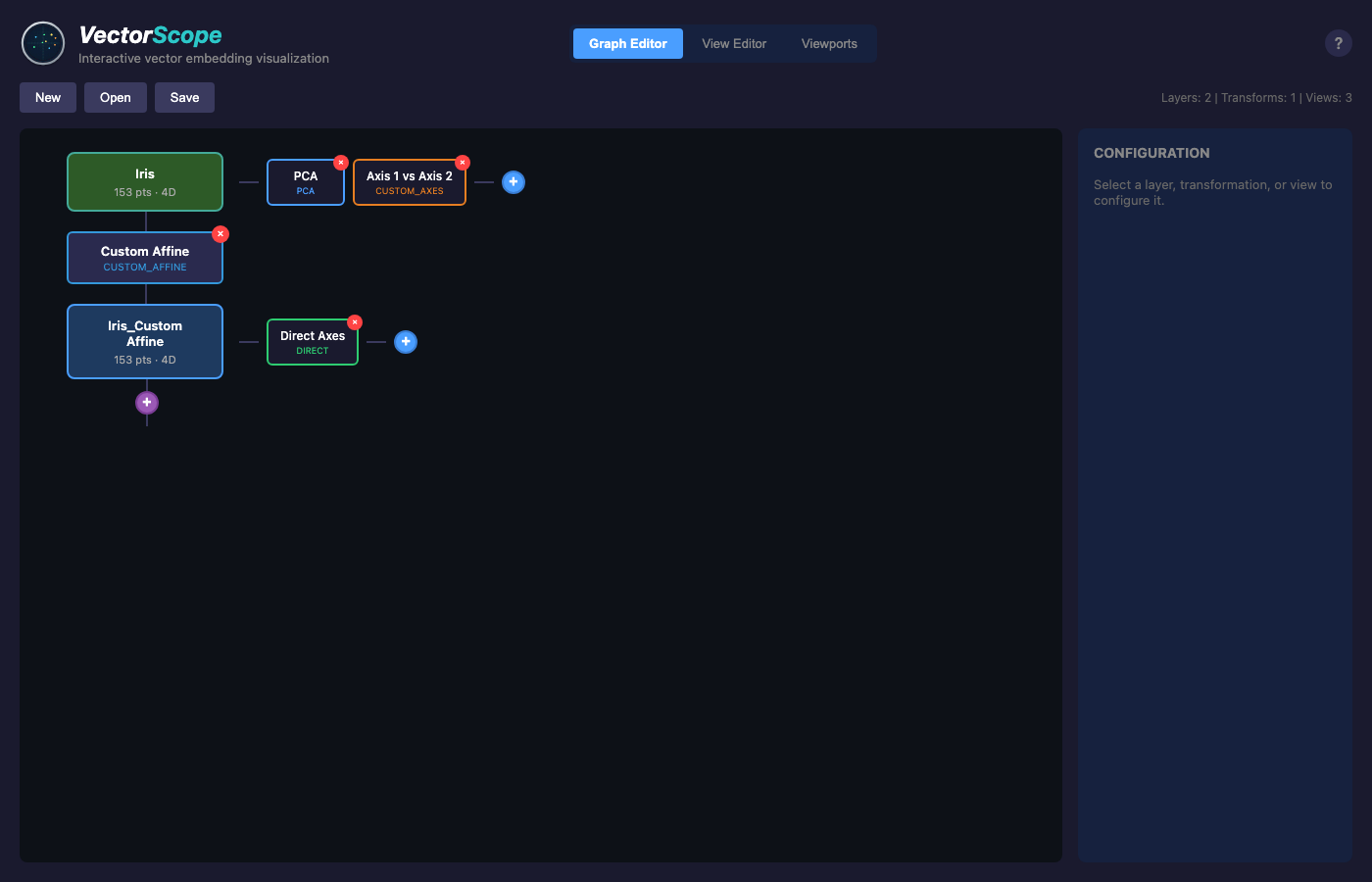
Understanding the Graph Structure
The example creates the following pipeline:
Iris (153 pts, 4D)
├── PCA View
├── Axis 1 vs Axis 2 (Custom Axes View)
└── Custom Affine Transformation
    └── Iris_Custom Affine (153 pts, 4D)
        └── Direct Axes View
Iris Layer: The original Iris dataset with 150 samples plus 3 virtual points (class barycenters).
Custom Affine Transformation: Applies a change of basis where the first two axes are user-defined custom axes, creating a derived layer where coordinates represent distances along semantic directions.
Iris_Custom Affine Layer: The transformed data where:
Dimension 0 = coordinate along Axis 1 (setosa→versicolor direction)
Dimension 1 = coordinate along Axis 2 (setosa→virginica direction)
Dimensions 2-3 = standard basis components
Creating Custom Axes
Custom axes are created from pairs of virtual points (barycenters):
Create Selections: Select all points of each class
Create Barycenters: Click “+ Point” to create a centroid for each selection
Define Axes: Select two barycenters and click “Create Axis”
In this example:
Axis 1: Direction from setosa centroid to versicolor centroid
Axis 2: Direction from setosa centroid to virginica centroid
The Custom Axes View
The “Axis 1 vs Axis 2” view projects each point onto the custom axes:
X coordinate: How far the point is along the setosa→versicolor direction
Y coordinate: How far the point is along the setosa→virginica direction
This gives a semantically meaningful 2D view where:
Setosa samples appear near the origin (low X, low Y)
Versicolor samples have high X values
Virginica samples have high Y values
Comparing Views Side-by-Side
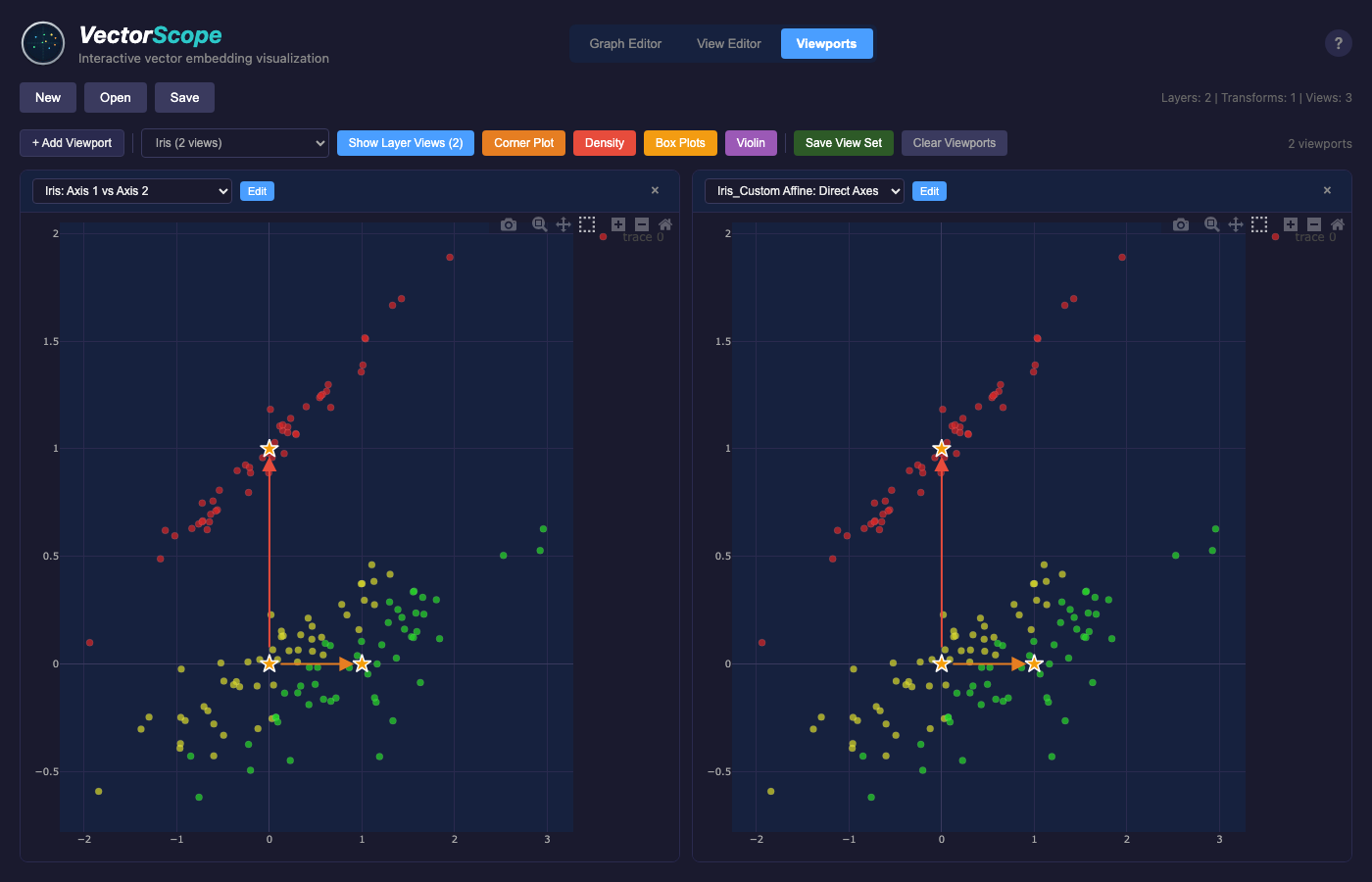
Switch to Viewports mode to compare views:
- Left Viewport (Iris: Axis 1 vs Axis 2):
Shows the original data projected onto custom axes using oblique projection. The axis arrows show the directions of each custom axis.
- Right Viewport (Iris_Custom Affine: Direct Axes):
Shows the transformed data using dimensions 0 and 1 directly. Since the Custom Affine transformation uses the same axes, this view should match the Custom Axes view when using oblique projection mode.
Projection Modes
The example uses oblique projection mode, which finds the closest point in the plane spanned by the axes. You can also try affine mode:
Select the transformation node in the Graph Editor
Change Projection Mode to “Affine”
Observe how the coordinates change
See Transformations for details on the difference between modes.
Key Concepts Demonstrated
Virtual Points: Barycenters act as anchor points for defining axes
Custom Axes: User-defined directions based on data semantics
Custom Affine Transformation: Change of basis to align data with custom axes
Linked Views: Compare the same data in different coordinate systems
Next Steps
Try modifying the example:
Create additional axes (e.g., versicolor→virginica)
Add a Custom Axes 3D view with three axes
Compare oblique vs affine projection modes
Apply the transformation to a different dataset
See Also
Annotations - Creating selections and barycenters
Transformations - Custom Affine transformation details
Projections - Custom Axes projection parameters