Quickstart
This guide will walk you through your first VectorScope session.
Starting VectorScope
Option A: PyPI Installation (Recommended)
If you installed via pip install vectorscope, start VectorScope with:
vectorscope
This single command starts the backend API and serves the frontend UI together. Open http://localhost:8000 in your browser. You should see the VectorScope interface with the logo and an empty graph editor.
Command-line options:
vectorscope --port 9000      # Use a different port
vectorscope --host 0.0.0.0   # Listen on all interfaces
vectorscope --reload         # Auto-reload for development
Option B: Development Installation
If you cloned the repository and installed with Pixi, you can run the backend and frontend separately for development with hot-reloading:
# Terminal 1: Backend with auto-reload
pixi run uvicorn backend.main:app --reload --port 8000

# Terminal 2: Frontend dev server
cd frontend && npm run dev
Open http://localhost:5173 in your browser. The frontend dev server provides hot module replacement for faster development.
Configuring Ports
By default, the server runs on port 8000.
To change the backend port:
uvicorn backend.main:app --port 8001
To change the frontend port:
cd frontend && npm run dev -- --port 3000
Note
If you change the backend port, you must also update the proxy target in
frontend/vite.config.ts to match.
Your First Visualization
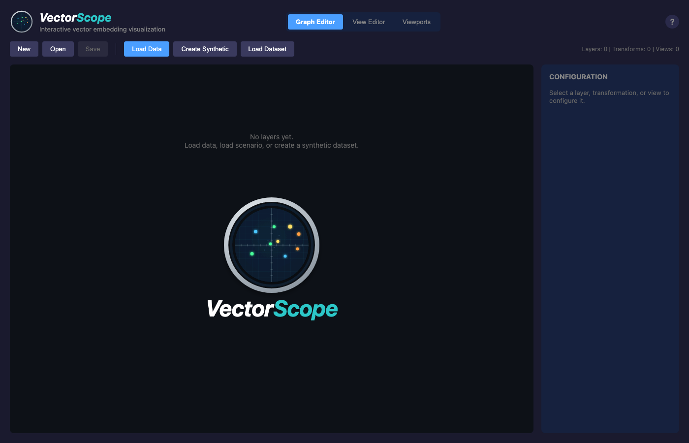
VectorScope initial state with empty graph editor.
Loading Data
When VectorScope starts with no data, you’ll see three options:
Load Data - Upload your own CSV, NPY, or NPZ file
Create Synthetic - Generate random clustered data
Load Dataset - Use a standard sklearn dataset (Iris, Wine, etc.)
Let’s start with the Iris dataset:
Click Load Dataset
Select Iris from the list
VectorScope automatically creates a PCA projection
Exploring the Graph Editor
The default view is the Graph Editor, which shows your data pipeline:
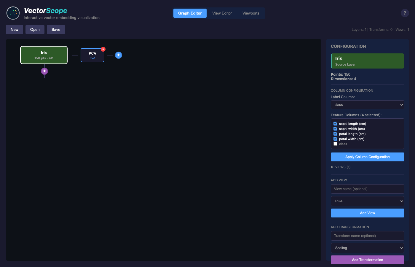
Graph editor showing the Iris dataset layer.
Green node (Iris) - The source data layer (150 points, 4 dimensions)
Blue node (PCA) - The projection that creates 2D coordinates
Click on a node to see its configuration in the right panel.
Viewing the Data
Switch to the View Editor tab to see the actual scatter plot:
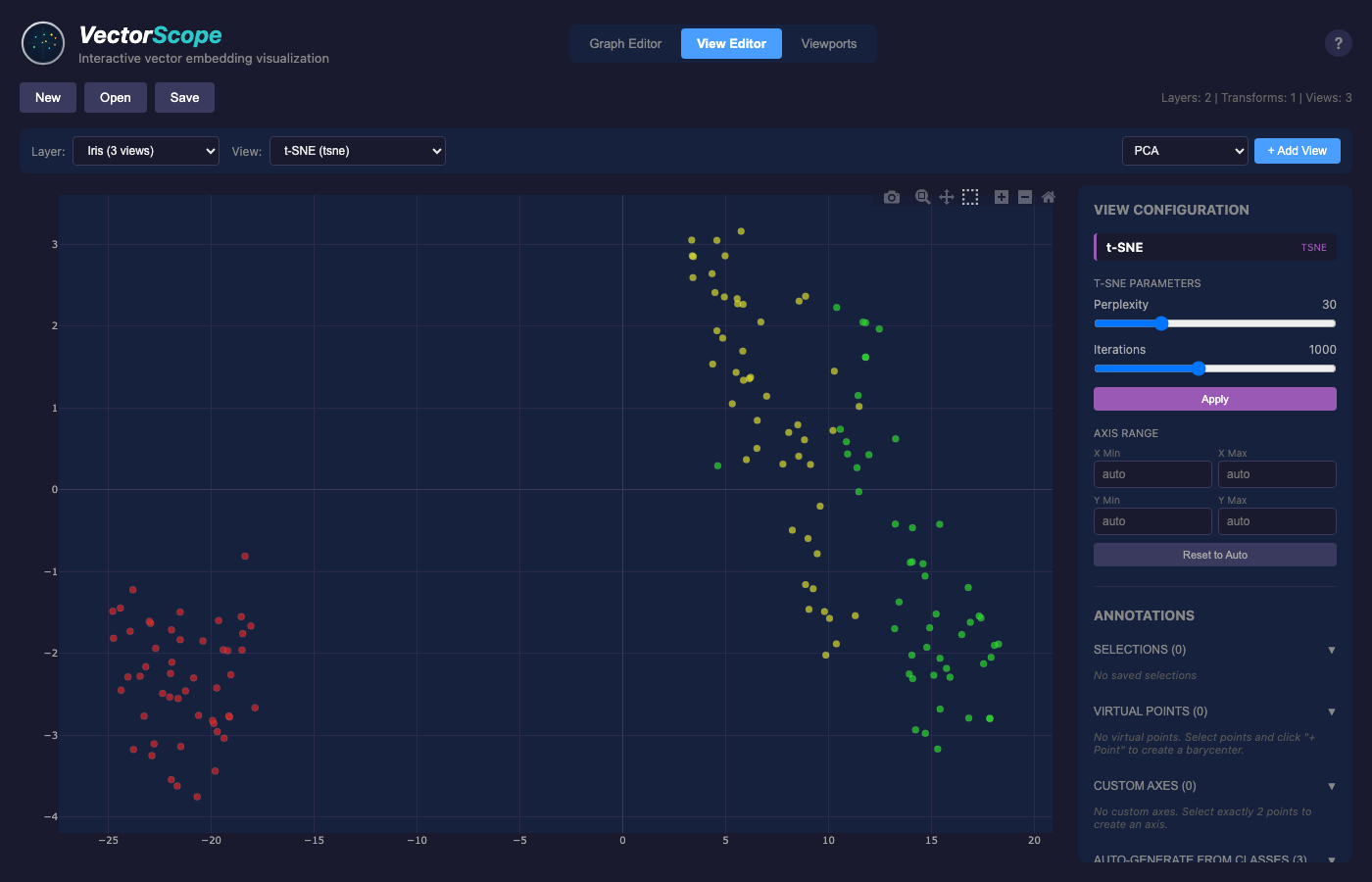
View editor with the Iris PCA projection.
Select a view from the dropdown (e.g., “Iris: PCA”)
The plot shows points colored by their class (setosa, versicolor, virginica)
Hover over points to see their labels
Adding Another View
Go back to the Graph Editor
Click on the Iris layer node
In the config panel, find “Add View”
Select t-SNE and click Add View
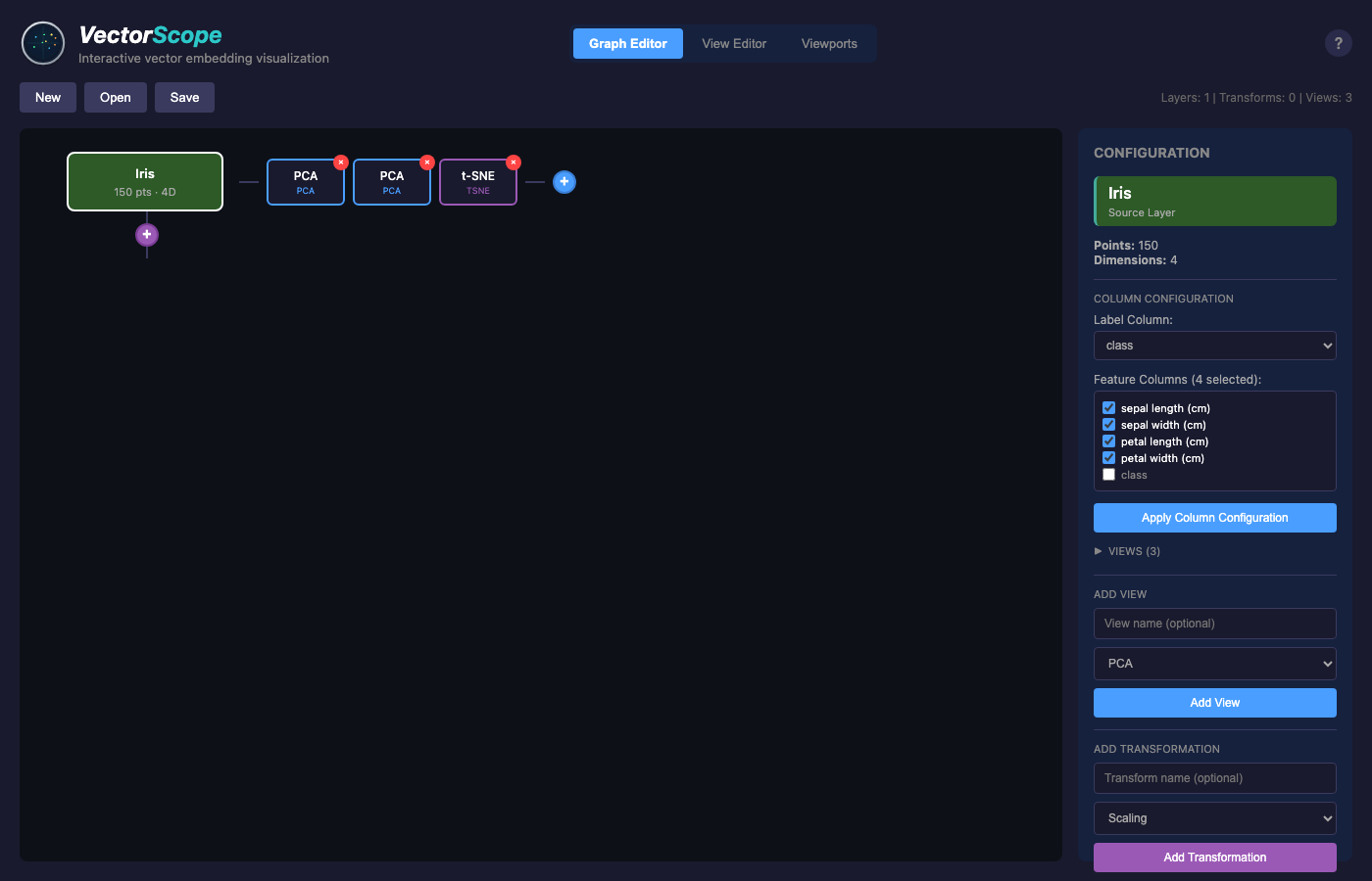
Graph editor showing a layer with a view node attached.
Now you have two projections of the same data. Switch to Viewports mode to see them side by side.
Adding Transformations
You can apply transformations to your data before projecting:
Click on the layer node
In the config panel, click “Add Transformation”
Choose a transformation type (PCA, scaling, rotation, etc.)

Graph showing a PCA transformation node creating a derived layer.
The transformation creates a new derived layer that you can project separately. For example, PCA transformation decorrelates your features, which can reveal different structure when you apply subsequent projections.
Exploring Multiple Views
Switch to the Viewports tab to see multiple projections side by side:
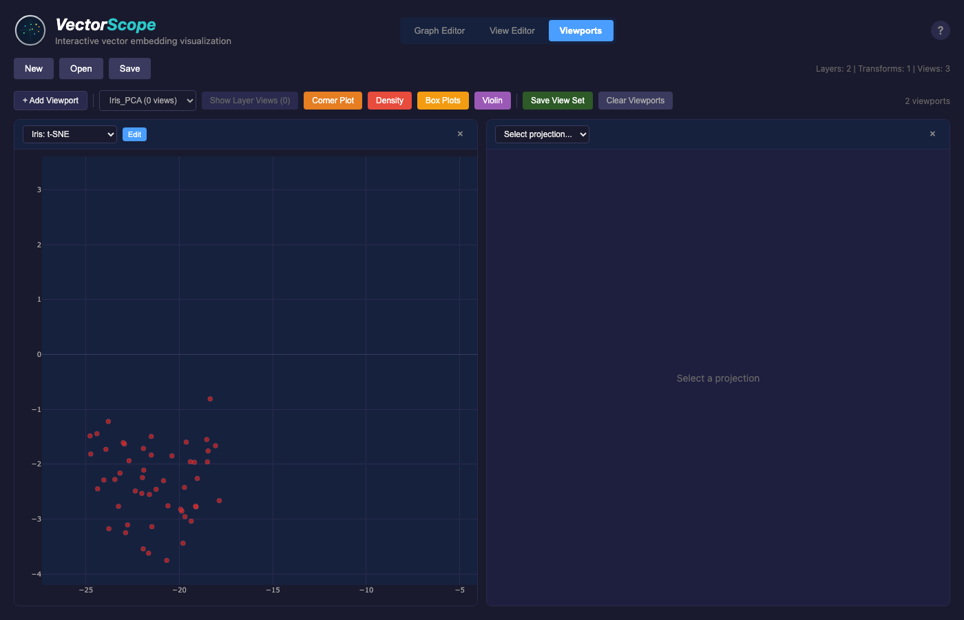
Viewports mode showing PCA (left) and t-SNE (right) projections of the same data.
This lets you compare how the same points appear in different projections. PCA shows the directions of maximum variance, while t-SNE emphasizes cluster structure.
Exploring Feature Distributions
VectorScope provides 1D views for exploring individual feature distributions.
Density View
To see the distribution of values for a single dimension:
Click on a layer node
Click the “+” button and select Density
Switch to View Editor and select the density view
Use the dimension selector to explore different features
Toggle between KDE (default) and Histogram modes
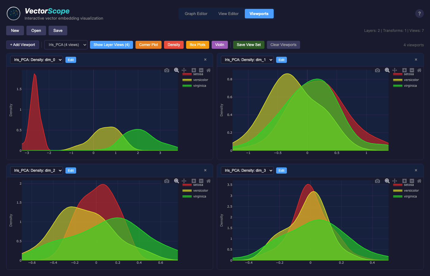
Density view showing the distribution of a single dimension using KDE curves. Points are colored by class, making it easy to see how classes separate along each feature.
Box Plot View
To compare feature distributions across classes:
Click on a layer node
Click the “+” button and select Box Plot
Switch to View Editor and select the box plot view
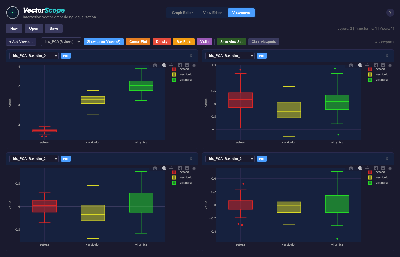
Box plot view showing feature distributions grouped by class. This helps identify which features best separate your data classes.
Violin Plot View
Violin plots combine box plots with density curves to show both summary statistics and the full distribution shape:
Click on a layer node
Click the “+” button and select Violin
Switch to View Editor and select the violin view
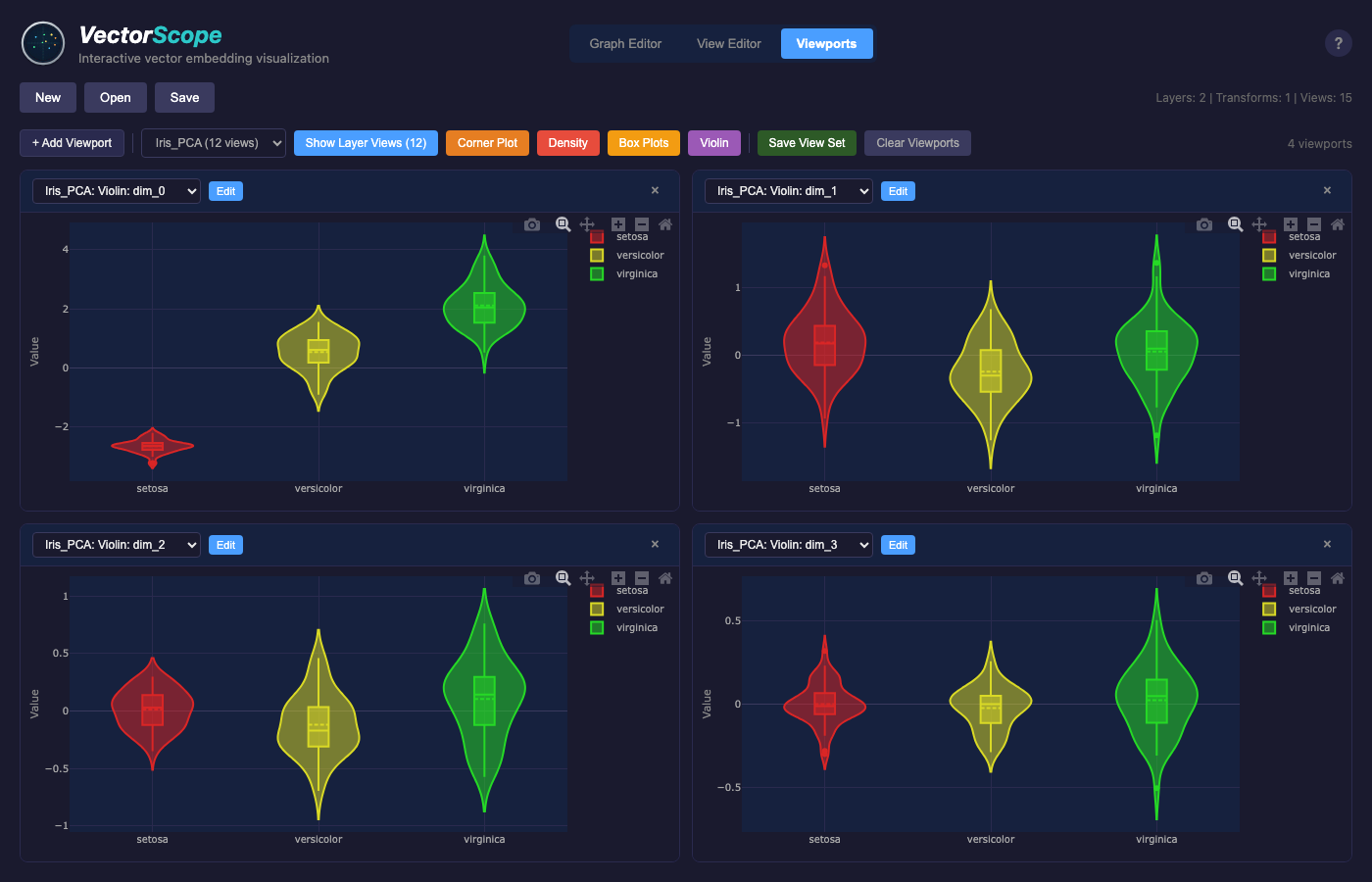
Violin plot view showing distribution shapes for each class. The width of each violin represents the density of points at that value.
Violin plots are particularly useful for:
Seeing bimodal or multimodal distributions within classes
Comparing distribution shapes across classes
Getting both box plot statistics and density visualization in one view
Saving Your Work
Click Save in the toolbar
Enter a name for your session
Your data, projections, and settings are saved
To reload later:
Click Open
Select your saved session
Next Steps
Learn about Core Concepts - layers, transformations, projections
Explore Loading Data - work with your own data
Read Transformations - apply scaling, rotation, etc.