This is my first attempt at a collaboration map -- it's woefully incomplete and I've largely omitted projects happening within the ATLAS collaboration. Check it out first, and then read the blog post below. The collaboration map has three components:
- people: center
- projects: left
- collaborations: right
For a long time I've wanted to come up with a nice way to visulize my collaborative network. I've played with graphviz, but never been satisfied. I worked with Pablo Barberá last year to make something for our report for the Moore-Sloan Data Science Initiative, and we came up with this:
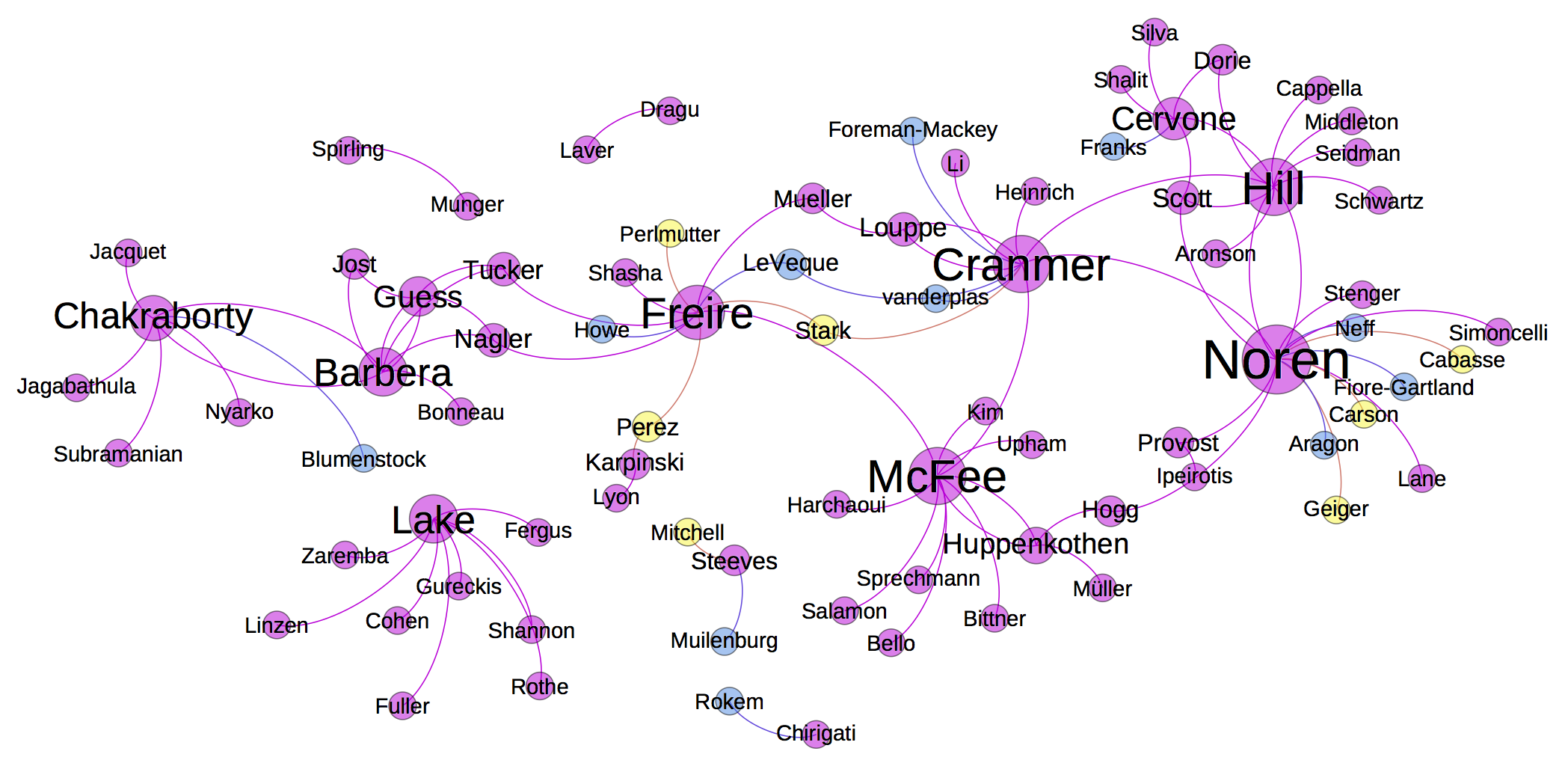
It's ok, but it is lacking structur and semantics. I'd like to be able to visualize how people work on common projects and how they are associated to different collaborations. This tends to be a many-to-many relationship.
The Concept Map
While browsing the d3 gallery I saw the Concept network browser, which I believe is from Chris Willard. In addition to being visually striking and fun to play with, I liked how it has some semantic structure with people, themes, and perspectives.
Many thanks to Xianshun Chen for making his code for the concept map available. I modified my pelican-bootstrap3 theme to use the pelican_javascript plugin. Here are links to my source so you can see how I arranged the javascript, css, and markdown.
I'm not sure how to resize the d3 / css/ html code so that it sits in a responsive div, but if anyone has a hint, please add a comment.
A collaboration map
I decided to try to adapt the concept map to be a collaboration map. Initially I wanted to have people, specific projects, and broad themes like physics, statistics, machine learning, software, cyberinfrastructure, etc. Maybe I'll come back to that, but for now I've decided to break it up into
- people: with description that links to their homepage.
- projects: specific projects or perhaps topics of discussion
- collaborations: groups of people brought together with some common goal, theme, or for some other organizational reason
The visualization also allows one to group projects and collaborations, and I'm using this grouping so that projects connected by a common theme can be grouped (eg. LHC collaborations and cyberinfrastructure collaborations. While there are many collaborations in those gorups, the javascript code only seems to draw a line between two of them (if anyone has a hint, please add a comment). Also, it doesn't seem to show related projects (eg. RECAST doesn't show up here). These could be solved by someone with some d3 skillz. Ideally, the groupings could also be many-to-many.
One nice thing about this appraoch is that the input is JSON, so it should be easy to collaboratively guild this collaboration graph. I think this could be a cool project for the Moore-Sloan Data Science Initiative.
The interactive visualization at the top is my first try at a collaboration map.
Feel free to send a pull request for the input is JSON.
Comments
comments powered by Disqus